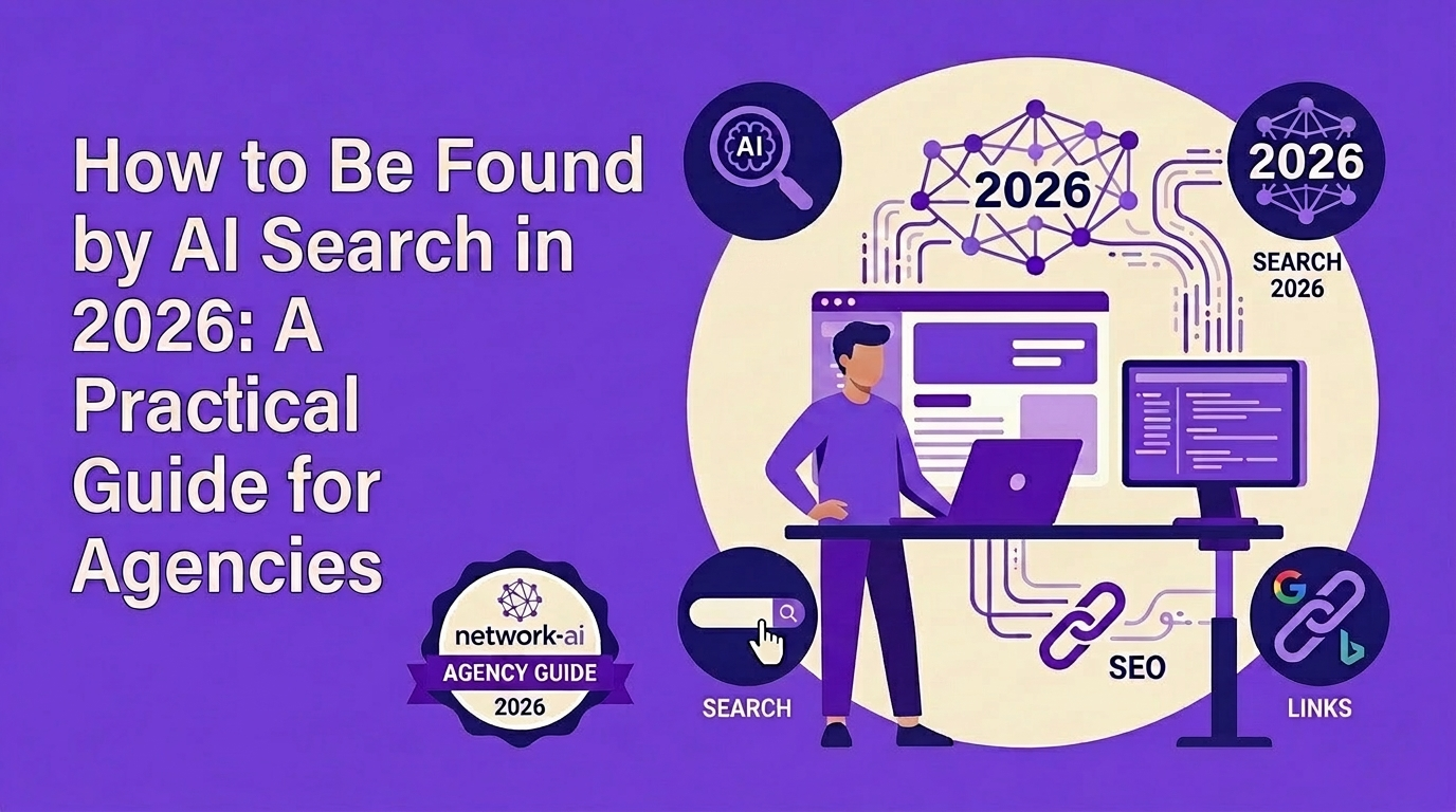
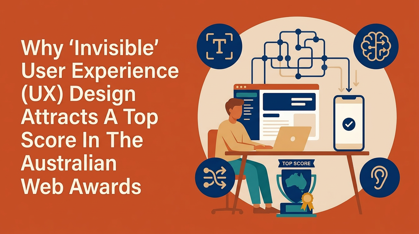
Why ‘Invisible’ User Experience (UX) Design Attracts A Top Score In The Australian Web Awards
TLDR; What you need to know:
After mastering the fundamentals (like navigation), you can then punch above the norm by adding micro-interactions and ‘narrative delight’ to upgrade your website from functional to premium.
Go beyond simple responsiveness by perfecting mobile-first details and making layouts accessible and legible on 4K ultra-wide displays.
Incorporate clear visual ‘affordances’, prominent CTAs, and seamless loading states to make the user journey invisible and effortless.
The friction between what you want to do on a website and actually doing it can bring frustration or joy; this is the realm of user experience (UX). The less friction, the better, which is easier said than done, but the best UX is often invisible – and it's where your Australian Web Awards (AWA) entry can gain (or lose) big points.
In this blog, we explore the discipline of UX, what our AWA judges look for in a winning entry, and give you five actionable tips to improve the experience of your digital work.
What is ‘user experience’ or UX?
UX is a broad discipline that brings psychology, design, and technology together to make sure a product is not only functional, but also meaningful and enjoyable to use. Like web development, it starts with this fundamental question: what is the user trying to achieve? Then, a UX designer creates the promise of an experience, whereas the web developer delivers it.
UX also acts as the bridge between a company's goals and a human's needs. When UX is done well, it’s often invisible – the user simply achieves their goal without frustration. When it is done poorly, however, it becomes the only thing the user can notice.
What do AWA UX judges look for?
As UX expectations continue to evolve, Australian Web Awards judges are increasingly looking beyond clean interfaces and smooth navigation. The strongest entries demonstrate a deep understanding of audience behaviour, balancing usability with emotion, identity, and purpose. As Avenue Design Creative Director Flavio Argemi explains, “great UX is about removing friction from the experience without removing its character” — a philosophy that shaped the studio’s work on the Visit Ballarat project and ultimately helped secure its place as a 2025 Australian Web Awards finalist for Best In Show.
“For us, great UX is about removing friction from the experience without removing its character. With Visit Ballarat, the goal was to help people move from inspiration to action as naturally as possible, whether they were planning a full trip, looking for something to do nearby, or discovering a part of the region they hadn’t thought to explore before. Strong UX should feel intuitive, but it should also reflect the personality of the place behind it.”
This approach highlights an important shift in how UX is being assessed across the industry. Judges are not only evaluating whether a website functions well, but whether the experience feels considered, engaging, and authentic to the brand or destination it represents. Projects that successfully combine accessibility, intuitive journeys, strategic thinking, and a clear sense of personality continue to stand out across award categories.
1. ‘Standard’ is the floor, ‘delight’ is the ceiling
Similar to content, if your site has mastered the basics (intuitive IA, clear navigation), you’ll get scored well, but you may get penalised for work that’s "conservative" or "predictable." Our judges look for micro-interactions, meaningful animations, and "narrative delight" that elevate a site from a functional template to a premium digital experience. Punch above the norm and be rewarded!
2. Frictionless wayfinding and a ‘sense of place’
A recurring issue for many judges is the lack of breadcrumbs and clear Information Architecture (IA). They want to know exactly where they are in the site hierarchy at all times. If a menu is "overwhelming," "bloated," or lacks "visual hierarchy," the score drops significantly.
3. Mobile-first precision
It isn't enough for a site to be ‘responsive’ (i.e., just fitting the screen). Judges look for mobile-specific features like sticky carts, finger-friendly button sizes, and appropriate text wrapping. They are quick to spot "lazy" mobile ports, like mega-menus that drop to plain text, or pricing tables that break on small screens.
5 ways to improve your UX score in the Australian Web Awards
1. Refine Visual Hierarchy and CTA Prominence
Visual hierarchy is the arrangement of elements in a way that implies importance. Judges often find that in high-fashion or minimalist entries, the Call to Action (CTA) was "swallowed" by the aesthetic. While a ghost button (a transparent button with a thin outline) looks elegant, it often lacks the necessary weight to draw the eye.
To improve your score, you need to balance brand beauty with functional "pop”. This means using size, colour, and whitespace to keep the primary goal of the page, whether it's "Add to Cart" or "Register Now" remains the most obvious element on the screen.
UX tip: Use a high-contrast colour for primary buttons so they don't get buried in long-form content; aim for a ‘squint test’ where the CTA is still visible when you blur your eyes.
2. Implement ‘Affordance’ for Interactivity
Affordance is a technical term for a visual clue that tells a user how to interact with an object. Awards judges frequently dock marks for ‘hidden’ interactions – horizontal sliders that look like static images, or 3D models that don’t clearly indicate they can be rotated. When a user has to guess whether they can swipe, click, or drag, it creates interaction friction.
To score well, your interface must speak to the user, giving immediate clues like small arrows, partial ‘peek-a-boo’ cropping of the next item in a list, or subtle hover animations. This also extends to micro-interactions and feedback loops, too.
UX Tip: Add scroll indicators to horizontal sliders and make sure all clickable elements have clear hover states (pointers/colour shifts) and immediate loading feedback.
3. Prioritise accessibility and legibility on all screens
Accessibility is not an optional extra in the Australian Web Awards; it’s a discipline of its own and also a core pillar of professional UX. Judges are particularly critical of sites that used small font sizes (12px or lower) and those that lacked sufficient contrast.
A common mistake is placing white text directly over a busy lifestyle photograph. While this looks modern, if the photo has light areas, the text becomes unreadable. Judges look for the use of subtle dark overlays, text shadows, or dedicated text containers that are legible regardless of the background image.
Similarly, ‘responsiveness’ must now account for 4K and ultra-wide monitors. A site that looks great on a 13-inch laptop can often break on a high-resolution screen, with text lines stretching too wide to read comfortably or fonts appearing tiny.
To improve your score, implement fluid typography or strict max-width containers for text blocks. If your site meets WCAG 2.1 colour contrast standards and maintains a comfortable line length (usually 45–75 characters), it shows the judges that you prioritise the user's physical comfort over just ‘looking cool’.
UX Tip: Audit your site at 12px vs 16px+ font sizes and use text overlays/shadows when placing white text over images for accessibility compliance across all devices and resolutions.
4. Optimise performance and loading states
Performance is an invisible but critical component of UX. A site that takes more than a few seconds to load ‘heavy’ assets, like hero videos or high-res galleries, will immediately lose points for ‘clunky’ behaviour. In addition to speed, sites that provide ‘seamless’ transitions – where elements move fluidly from one state to another, rather than disappearing and reappearing – create a sense of craftsmanship and technical excellence that separates winners from entrants.
To improve your score, focus on perceived performance. This involves using ‘lazy loading’ so the page is functional before every asset has finished downloading, making sure animations are hardware-accelerated to prevent ‘jerkiness’.
UX Tip: Implement skeleton loaders or progress bars for heavy content, and optimise image assets to eliminate choppy 3D or animation rendering.
5. Enhance the ‘Discovery’ journey
The ‘Discovery’ journey refers to how easily a user can explore your site without getting lost or hitting a dead end. AWA judges often report a lack of breadcrumbs, which are the navigational trail that shows a user where they are (e.g., Home > Women > Shoes > Heels). Without these, users can feel untethered, especially on deep E-commerce sites. Giving clear orientation cues allows users to jump back a level or explore related categories, which increases the time spent on the site and the overall logic of the experience.
Beyond basic navigation, our judges keep an eye out for narrative delight: how disparate parts of the site are linked together to form a cohesive story. For example, if a user is reading a blog post about a specific project, providing a ‘Related Case Studies’ section or a direct link to the products mentioned creates a circular UX, rather than a linear one. This reduces the number of clicks needed to find relevant information and makes the information architecture feel ‘intelligent’ and user-centric, not just a storage folder for pages.
UX Tip: Add breadcrumbs to every sub-page and include ‘Related Content’ or ‘Recommended Products’ to keep the user flow continuous and avoid navigational dead ends.
Find a more connected experience offline with AWIA
If creating better digital experiences is one of your goals, consider joining AWIA. In addition to hosting the Australian Web Awards, we also host networking events around Australia – and an online member’s directory – to bring the industry together regularly. Meet your peers, connect on projects, and stay on top of what’s happening in Australia and around the world.
Written by: Dr Marion Piper Human, but also Creativity Coach & Copywriter
The Australian Web Awards recognise excellence across six core disciplines: Accessibility, Content, Design, Development, SEO, and User Experience. Subscribe to AWIA’s newsletter for 2026 awards updates, AWIA news and accessibility events as they’re released.